Narrows CrossFit: Landing Page UX Case Study
Case study examining the background, process, and results of Narrows CrossFit homepage redesign.
June 11, 2016
Narrows CrossFit reached out and tasked Burpee Over Bar with refreshing their site.
There was a number of business and design challenges with their existing site. As most gyms do Narrows uses Customer Relationship Management (CRM) software to handle membership and registration, but the integration with their existing site was clumsy and difficult to navigate. The site was not designed with mobile in mind and was tough to use from phones. Finally, the content was stale featuring former members and photos of a previous location. The content didn’t reflect the life and activity of their community.
Objectives
- Encourage website visitors to register for class through their CRM (ZenPlanner).
- Create a new mobile-friendly design because more than 50% of their visitors were on smartphones.
- Showcase and engage the highly active Narrows community.
Typography & Colors
Narrows CrossFit already had a strong color pairing with their branding, a dark Midnight blue and bright (nearly neon) Atlantis green. We used their blue to set the color tone of the homepage, and used their attention-grabbing green to draw eyes to their calls to action. Since these colors are very strong, we built a neutral palette that complements these colors.

Navigation
We settled on a sticky navigation that floats at the top of the page as the customer scrolls so that the high value actions of the site are never out of sight. Since the primary outcome is registering new web visitors for a class, the navigation used the call-to-action green to highlight this action. Located directly next to the nav call-to-action element is the secondary goal for web visitors, a link to the contact page. In the case that a client isn’t yet ready to register for an introduction class at the gym, it should be easy to reach out to the coaches and establish communication.

Responsive Design
One of the main objectives of the redesign was to make the site easy to use and navigate on mobile. The original site was tough to use on mobile. Since approximately half of the visits were coming from smartphones, it was vital that each component was designed to scale to the mobile form factor without any degradation of experience.


Choose Your Own Adventure
While the primary goal is to turn an online visitor into an offline visitor by getting them to register, the path to registration can be very different for different clients. CrossFit gyms have three primary groups to market to: experienced CrossFit athletes who are moving to a new gym, athletes who are new and unfamiliar with CrossFit, and athletes who are visiting town and looking to pay a small fee to drop-in to a class. Each of these groups has distinct concerns that need answered before they join.
For CrossFit gyms, these can be thought of as distinct products offered by the gym. So we designed a product offering bar, to help clients shop the product that’s relevant to them. In this bar, the most common case takes center stage with bright neon green. Each action from this bar takes the client to a secondary landing page which tries to answer common client questions, let them know what they can expect from their membership, and guide them through registering.

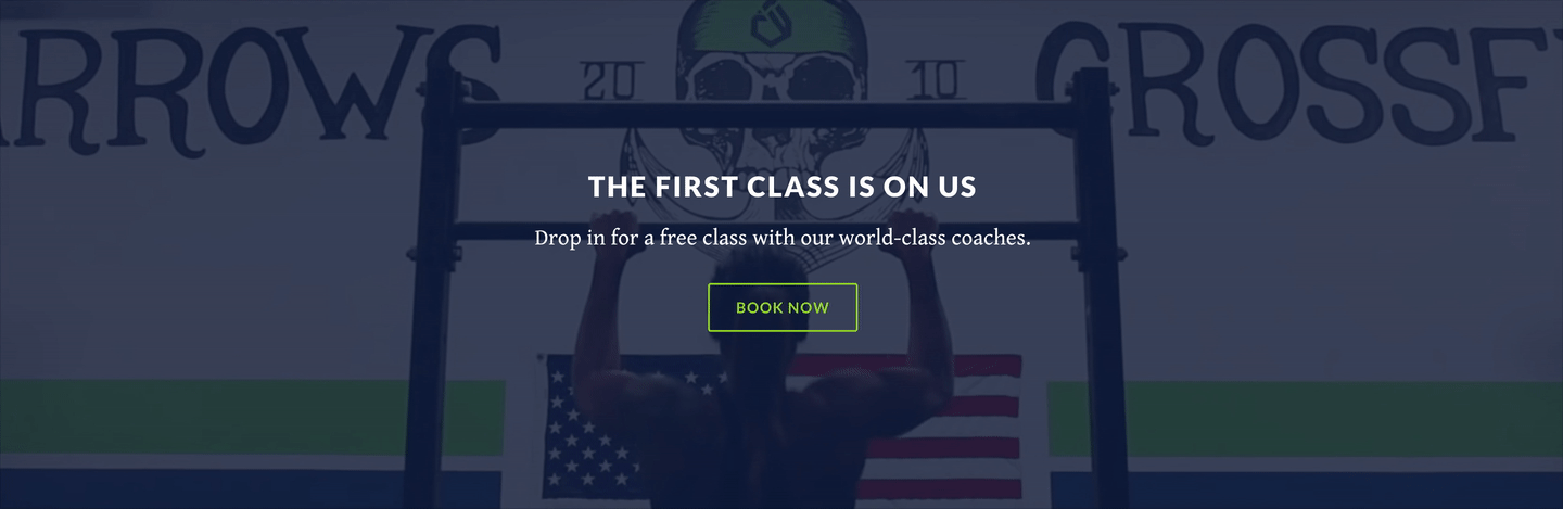
Primary Call-to-Action
After introducing the gym to new clients, it’s important to create an attention-grabbing section which laid out the primary offer of the website: the first trial class is free. To help this section stick out, we shot a video of one of their members and designed a full-bleed video background for the offer. It was important that it was a member of the Narrows community so that the video felt genuine (instead of stock footage).
We had found from discussions with female athletes that CrossFit can be intimidating when they see hulking athletes throwing around huge weights on the homepage. Narrows CrossFit’s community has many female athletes and they primarily market themselves to families, so it is important not to intimidate or alienate. To make sure that potential clients weren’t spooked away on the homepage, the video featured one of their accomplished female athletes doing an impressive but not overly intimidating movement.
Concerned about the page-load performance of a full-bleed video background, there were a few deliberate design decisions to minimize the impact. The video used a movement that was easily looped, so that the actual video file was short but played continuously. Performance is even more costly on mobile, so the page’s responsive design switches to a photo still instead of the heavier video on smart phones.
Community Events
Beyond growing the community, Narrows’ secondary objective is to leverage their site to keep their members active and involved in the community. Many of Narrows’ members visit their page daily to see the workout of the day (WOD). We designed an events board that showcases upcoming events so that members can easily discover and RSVP for events in their typical traffic patterns.

Instagram Reel
The CrossFit community is very active on Instagram, which makes the platform ideal for generating organic leads. Moreover, engagement on Instagram encourages members to engage more in their community and allows the coaches to collect feedback. To incentivize members and visitors to interact with their hashtag, we added an Instagram reel to the bottom of the homepage which shows the latest posts using the tag #NarrowsCrossfit. Members can see their post appear on the homepage, giving them a sense of ownership and a reason to regularly check the homepage.

All together
Putting all of these elements together, here’s the finished homepage design.

Results
At the end of the day, though, the only thing that matters in the design is if we helped the client reach their goals or not. As a result of the work, Narrows reported increased traffic, increased registrations, and that they have clients coming in the door telling them their website helped to differentiate them from their local competition.
We’re really proud to have the following testimonial from Matt regarding our work and the impact it’s had on their business.
We initially hired Zack and Vivian to essentially overhaul our gyms’ website. It was quite antiquated and we had high hopes that a fresh look and a more user-friendly site would attract members as well as help us retain our current memberships. And since the site has been live for several months, the traffic to the site has grown exponentially and we’ve had more people drop in and/or sign up than we’ve had in the past few years. When we ask them what initially attracted then to Narrows Crossfit, they tell us it was our website! I’d call that success!
As we started meeting with Zack and Vivian, we presented our ideas and thoughts to them and they were extremely responsive and put everything we wanted into the site and gave us ideas for making it even better. I am so glad they did. It ended up feeling like “our” website but was so much more user-friendly and fluid than we could have hoped for. On several occasions, they made the 50+ mile drive to meet with us and discuss progress and ideas.
I would absolutely recommend Zack and Vivian to any friends looking to increase business through an improved website. Whether or not your have a gym or any other small business, you will be glad to had them in your corner to help your business more successful.
– Matt Ludvig, Owner and Coach at Narrows CrossFit
Burpee Over Bar does mobile and web design for CrossFit and fitness businesses. If you’d like to work together you can also contact me directly.